M3 - Explain what codes and conventions you've used in your adverts
M3- Codes and conventions in my advertisements
As a part of the advertising campaign, the client has asked me to create a TV advert, web banner and print advertisements for my Effervescent healthy fizzy canned drink.
In all the advertisements, I have used the same message throughout to create a successful advertising campaign “For a happy, healthy and Instagrammable morning”. This is a convention of advertising campaigns and adverts in general, there is no point in having an advert without a slogan or message to create brand identity. All the advertisements are based around the advertising campaign message, the message says that the Effervescent canned drink is great for social media pictures and might get you more likes.
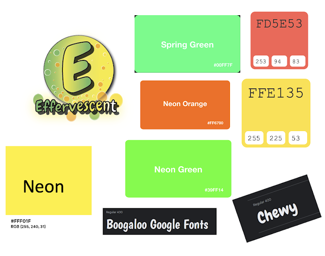
My logo is also a convention of advertisements; you can see the Effervescent logo all throughout my advertising campaign. The logo can be seen in the top right corner of my web and print advertisements, and on the can in the tv advertisement. The logo creates brand identity and when the audience sees it, they will think of the Effervescent healthy fizzy banana flavoured canned drink.

The print advert I created is A4 (210 x 297 mm) because I created a magazine advert, and they are usually A4. The web banner advert I have created is a large rectangle banner (336 x 280 pixels).
The USP (which is an advertising technique) of the Effervescent healthy fizzy canned drink is it is banana flavoured. Not many other drinks in the drink market have this flavour so this will intrigue my audience. This will help to increase sales and create hype around the drink.
The Effervescent TV advert starts with a monochrome video (I edited it like this to make the mood sad like the character is) and the character makes a cup of tea. Then they take pictures of the cup of tea and post this on Instagram, they only get a few likes which makes them sad. This links to the target audience of 16–25-year-old males and females of all ethnic minorities because they will have grown up with technology (they are digital natives) and they use social media frequently. Furthermore, there are trends where people take photos of their food and drinks so this links to social media trends and it is relevant. I then use a propositional message (create a solution to a problem) by showing how taking pictures and posting the Effervescent canned drink on social media could possibly give the target audience more likes because the “can design is sleek, trendy and vibrant”. This is a convention of TV advertisements; they try to show the audience why they need their product. This advert also creates awareness of the product and general brand awareness. I have used mise en scéne (placing in the scene) in this TV advert by setting the scene in my kitchen in the morning. This then helps the audience relate to the TV advert because they will relate to the situation. Furthermore, I have used the cup as a prop that has the words “Cup of cheer” to give some funny dramatic irony to the advertisement when the character is sad. I have used a soft sell narrative by promoting the Effervescent canned drink more passively and including it in my advert storyline.
The next morning, the character gets the Effervescent healthy fizzy banana flavoured canned drink out of their fridge and drinks it. Then they take photos of the Effervescent canned drink with their phone, and they post them on Instagram to get more likes and positive comments (this shows how the Effervescent drink can fix the audience’s problems). I have used mise en scéne once again for the lighting. The lighting is from the sun streaming through the window. This shows how the character is happy this morning and they have more of a positive outlook. The canned drink is colourful like the video. At the end of the TV advert, I have included some text and voiceover (which is an audio code) that says “Effervescent banana flavour, for a happy, healthy and Instagrammable morning” while the Effervescent drink can is next to it. This is a TV advert convention because lots of them have this kind of end screen style to show the advertising campaign message or slogan so that the audience remembers it and the can. I have used a technical code by using short and snappy videos that move to the beat. This makes the TV advert look professional and the fast beat music helps us think of fizzy drinks. This will draw in the target audience who would probably like fast mainstream pop or dance music.
For the effervescent web and print advertisements, I have included the logo, campaign message, can design and social media icons which are all codes and conventions of print and web advertisements (but not the social media icons). This is more of a brand awareness advertising campaign. Both advertisements look very similar, they have lots of bubbles, a phone and tablet border, the same fonts…. This creates consistency.


These are my visualisation diagrams for my Effervescent drink can design, logo design, print advertisement and web advetisement. As you can see, I have used an Effervescent logo that looks exactly like my finished logo, the can design looks the same as the visualisation. The print design looks a little different but it is very similar, I didn't include the leaves at the top of the border, the smiley face is just a camera photo button, I have included the words "Find us on social media" and the social media icons to help my audience participate in a social media campaign. I have also included my Effervescent logo at the top. I have used the codes of conventions by including a logo, I have a USP with the banana flavour and social media campaign, soft sell technique, icons for social media and a friendly indirect mode of address. The web banner advertisement looks similar except I placed my text differently and included social media icons.


Comments
Post a Comment