P2 - Proposal into how you will solve the brief
Pitch
What have you asked us to do?
Your company (Coca Cola LTD) has asked my independent company to design a new healthy fizzy drink with an advertising campaign. You have asked us to choose a fruit flavour from your recommendations and we chose to create a banana flavoured drink. We believe this is the best fruit flavour for the healthy fizzy drink because this would be one of the unique selling points of the product as there is a gap of banana flavoured drinks in the market. You have also asked us to create a plan for: A TV advertisement, billboard, web banner and magazine advert. However, you have asked us to only produce the web banner and magazine advertisement for the campaign. In addition, you have asked that the target audience for the healthy fizzy drink and the campaign is 16–25-year-old men and women of all ethnicities.
We have considered all the requirements from the client brief you gave us.
What is our brand?
The healthy fizzy drink name we can up with is called Effervescent. We chose this name because effervescent is an adjective to describe something fizzy or bubbly (which fits with the drink) and to describe someone with a bubbly personality. We experimented with brand name ideas. However, we decided that Effervescent would be the best and suitable brand name for the healthy fizzy drink because the target audience will be interested in the name, and it exudes happiness.
Brand guidelines
I have been asked to create an advertising campaign for a new healthy fizzy drink. I have chosen to do a banana flavoured healthy fizzy drink because it is the least common flavour used in the drinks market; this is the USP of the drink. The brand name is Effervescent.
I want a “friendly but informative” advertising approach for my multi-media advertising campaign. I want my brand and fizzy drink to make people feel happy and energised for the day ahead. The consumers could use this in the morning more specifically or on a work break. My slogan will be “The happiness formula”. This shows the purpose of the drink, to make people’s day (especially morning) a little better and happier.
The fonts I will using are called Chewy and Boogalo, they are both downloadable from google fonts. I will use the font chewy for my brand name; I believe this font shows the fun and happy nature of the drink while catching the attention of the target audience. I will use the boogaloo font for the text on the drink.
I am going to use the colours sunset orange, spring green, and banana yellow. However, I might be using neon green, orange and yellow.
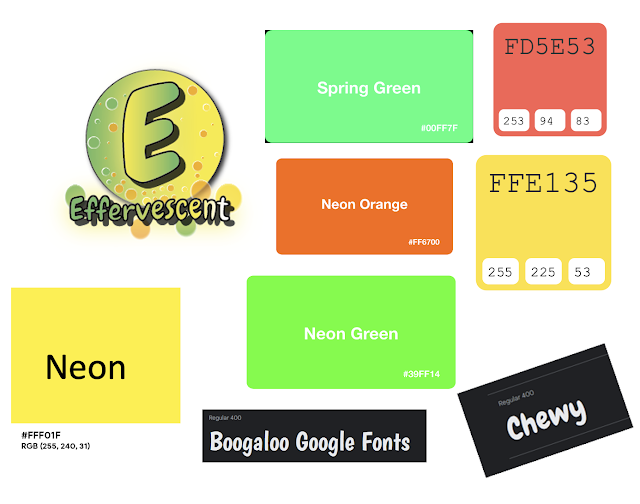
I have improved my brand guidelines by using images to show the exact colours and fonts I will use for my Effervescent healthy fizzy drink design. I have also included the logo I created using Adobe Illustrator for the Effervescent brand. This improves my brand guidelines by creating a more visual approach and being more specific with my design choices, this helps to show the reader what the colours, fonts and my logo looks like as I talk about them in the brand guidelines document.
Brand ideas
I want my healthy fizzy drink and the brand to make the consumers feel happy, energised, and ready to seize the day. Being one of their five a day, they will also feel as if they are making healthy choices and they will feel good about it.
I have accumulated different brand name ideas for my healthy fizzy drink brand. I want to highlight the fact my drink is fizzy and the happiness aspect. Here are some of my brand name ideas:
Fizzsplosion- My drink must be fizzy. I incorporated the word fizzy into my brand ideas and fizzsplosion clearly tells us that the drink is fizzy. However, I don’t like the name that much and it doesn’t show that happy and healthy energy of my brand and the drinks. This brand name sounds like the drink would be unhealthy and my target audience would be put off by this, it would attract the wrong audience.
Bubble Blast- The alliteration of this brand name is good, but it sounds childish and not very grown up and sophisticated, my target audience (16–25-year-olds, male and female, culturally diverse) probably wouldn’t be interested in the brand name. In addition, this only tells the target audience the audience the drinks are fizzy and nothing else.
Bubbleicious- A combination of the words bubbly and delicious. Similarly to the Bubble Blast brand idea, it doesn’t tell the target audience much about the brand.
Serenity- This word means calm; however my brand and healthy fizzy drink line is about making the consumers feel happy about the day ahead and a little energetic, the word serenity contradicts this.
Optimistic- This is my second favourite brand name idea. Optimistic relates to the happiness and seize the day nature of my brand and healthy fizzy drink. However, I also want to show the brand’s fizzy drinks are healthy and fizzy.
Effervescent- This is my favourite and best brand name idea. Effervescent means fizzy and the bubbles in a drink, it also means a bubbly, energetic and cheerful personality. I think this resembles my brand of heathy fizzy drinks perfectly; my target audience would find the name of the brand interesting.
Healthy Fizzy Drink Target Audience
I have been assigned to create a new healthy fizzy drink for Coca Cola LTD. They have asked that the target audience be 16–25-year-olds (the younger generation, Generation Z) males and females and a culturally diverse range of people. I am also going to target social grades C1-E. I am targeting these
groups because I want my Effervescent drink to make them feel happy
throughout the day. They can drink the Effervescent drink on their
break, more manual workers would like my drink because they would need
to drink more liquids. Professionals would use the Effervescent drink to
relax. In my advertisements, I will use a friendly indirect mode of address to reach a broad target audience and to make my drink seem relaxing instead of in the audience's face.
I will be taking this into consideration throughout my design process; the target audience changes how I should present the drink, the away I advertise and the slogan.
I am going to design a banana flavoured healthy fizzy drink. Banana is the least used fruit drink out of the list (Strawberry, mango, pineapple, apple and banana) which is one of the key USP for my healthy fizzy drink. Explorers in this age group would especially like this as they like to try new things and they like innovative brands; not many other drinks have a banana flavour, especially fizzy drinks.
My healthy fizzy drink is going to be called Effervescent. Effervescent means fizzy and bubbles in a drink however, it can also mean a bubbly and cheery in terms of personality.
My house style needs to be appropriate and attract my target audience. My target audience would like vibrant colours (as opposed to darker more boring colours) and a sans serif font. Brighter colours would attract my target audience of 16–25-year-olds as they are teenagers and young adults, they would like colour in the design, and this would also help the drink stand out. In particular, colours that appeal to both males and females so having blue or pink as the house style/ main colour in the colour scheme wouldn’t be appropriate. Sans serif fonts would be more appropriate to my target audience because the fonts are sleeker and more modern compared to serif fonts which would be more relevant to an older age range. My brand name Effervescent would intrigue my target audience (16-25 years of age, male and female, culturally diverse) because it sounds interesting and the name sounds grown up, plus it has a good meaning behind it. The design for these adverts and the can has to look appealing and captivate the attention of the target audience.
In the adverts, I will show a range of culturally diverse people who are male and female to reach out to my target audience.
Visualisation diagrams and storyboards

The client brief asks for me to create a magazine advertisement for the advertising campaign, this is my visualization diagram to show what the final advertisement is intended to look like.
I have used the colours orange and yellow, orange represents sunrise whereas yellow represents happiness. I also used the colour orange because my target audience should drink the drink in the morning to feel happy and healthy for the rest of the day. I want Effervescent to be associated with happy feelings and I will achieve this using bright colours.
This magazine advertisement will be A4 (210 X 297mm) and you would see this advertisement in food, health, social media and celebrity, culture and lifestyle magazines. I have chosen to have this advertisement in these types of magazines because my target audience would read these these types of magazines: They are health conscious, and the celebrity magazines are what the 16–25-year-old target audience would like reading.
The message for the Effervescent banana flavoured fizzy drink advertising campaign is “For a happy, healthy and instagrammable morning!” Therefore, the visualization diagram shows a phone taking a picture of the canned drink on a beach. This reaches the target audience of 16–25-year-olds because they are digital natives and use social media everyday so it will appeal to them.
I have used a smiley face camera button to further show that the drink is about bringing happiness to the target audience.
I am going to use the same font as my Effervescent canned drink, this will create brand identity and the target audience will associate this font with the effervescent brand.
I am going to use an image of a beach because this shows how calm and happy this drink will make the target audience feel.
The beach image has leaves on it and I have also included banana leaves at the bottom of the phone screen to compliment the banana flavour.

Here you can see breakfast food like pancakes and eggs. There are also healthy fruits on the breakfast table such as grapes, strawberries and blueberries. This relates to the healthy aspect of the drink; the drink is banana flavoured and it has healthy natural ingredients.
The purpose of the Effervescent healthy fizzy drink is to be consumed in the morning, this is one of the target audience’s five a day and it keep them happy and positive throughout the day. Therefore, I have chosen a breakfast table design for this web banner advertisement. In addition, this relates to the “For a happy, healthy and instagrammable morning” cross media advertising campaign message because lots of people take a picture of their food. This shows how the Effervescent can is photogenic and is also used for this purpose, this draws in the 16-25 male and female target audience.
The client brief has asked me to also create a web banner, so this is the visualisation diagram to show what the final static web banner advertisement is intended to look like.
To keep consistency throughout the multimedia advertising campaign, I have used the same message: “For a happy, healthy and instagrammable morning!”. I have also included a tablet styled border that looks is orange and yellow and very similar to the magazine visualisation diagram with a smiley face camera button. I forgot to add a camera at the top of each of the visualisation diagrams so I will do this when creating the design for these advertisements. I have also added lots of banana tree leaves throughout both of the visualisation diagrams to emphasise the health aspect and flavour of the Effervescent healthy fizzy drink with bubbles showing that the drink is fizzy.


I am going to use POV, medium and close up camera shots. The POV shots show how the character is taking pictures of their food for social media and how they see the world (the Effervescent drink will glow when they open the fridge on a POV camera shot to show how the drink is a life saver for them and how they can Instagram it). The medium camera shots show how the character reacts to the drink and this shows the target audience how happy they can be. The close up camera shots of the canned drink with the pan to the right showcase the drink. I have also used a screen recording of my own Instagram and how the Effervescent drink gets more likes compared to the boring tea or coffee.
I am not going to use foley sounds, I will use sounds from the video such as the fridge opening or the can hitting the table sound. I will however use a voiceover to ingrain the name of the Effervescent brand in my audience's minds to create brand identity. In my editing, I will also use editing techniques such as making the first half of my advertisement black and white to show how boring and unhappy the person is. The video will turn bright and colourful the next morning when they switch their mundane coffee/tea and breakfast for the Effervescent drink. This will how how happy the drink makes them. The Effervescent drink will be glowing and bright when the character opens the fridge to show how the Effervescent drink solves their boring life problem. I will use happy background music and edit the scenes to the beat of the song to show how happy the drink makes you.
Effervescent mood board

My drink will make people feel happy and ready to take on the day, they will also feel a little energised and healthier. This is best to drink in the morning. They can use it after exercise, as a healthy option or on a diet too.
Images I could use
https://commons.wikimedia.org/wiki/File:Orange_Background.png
https://www.flickr.com/photos/webtreatsetc/5756835306/sizes/l/
https://www.deviantart.com/magical-mama/art/FREE-Sky-Water-Background-Orange-251895951
Bubbles:
https://search.creativecommons.org/photos/35ad0ab8-ab98-4ecc-bcea-0217dc8a4610
Banana:
https://search.creativecommons.org/photos/e51b57c9-ba3f-4ce5-9cc1-aa1d7865c80c
https://www.flickr.com/photos/merripat/16014574470/
Banana tree leaf:
https://www.pngaaa.com/detail/1858127
https://www.pngaaa.com/detail/1857982
Effervescent can and logo visualisation diagrams

I have created a visualisation diagram for my healthy fizzy drink and logo called Effervescent. A visualisation diagram is a rough sketch or drawing to show what the final static product is intended to look like.
I want my canned healthy fizzy drink to make people feel happier and ready for the day ahead when they drink it. Therefore, it is a great drink in the morning or throughout the day to boost happiness. In addition, the drink is healthy and the target audience will feel happier as they are thinking about their health and having one of their five a day.

Green and yellow gradient:
The client brief states that I must make a healthy fizzy drink. I have used the colour green (neon green) in the brand logo Effervescent to show that the drink is going to be healthy, in colour theory we associate the colour green with good health and nature. I have also used the colour neon yellow to make sure the brand is associated with happiness because the purpose of Effervescent drinks is to make the target audience of 16–25-year-olds feel happy and it also helps them be happy and it also helps then be happy as they are making a healthier choice.
Orange:
A colour from my house style/colour scheme. I have chosen this neon orange colour because it shows how modern and vibrant the brand is and bright colours would attract my target audience.
Round circle logo shape: Symbolises friendliness and kindness, the circle is soft and not edged.
Bubbles: The effervescent drink is fizzy; I have shown this aspect of the drinks by using bubbles towards the bottom and less towards the top. This draws the attention to the brand name. Furthermore, the bubbles show the brand is fun.
Font and shadow: I am going to use Chewy from Google fonts because it is a modern but fun looking font. I am going to use a drop shadow to make the logo stand out against my canned drink design.

Orange yellow gradient: I wanted to create a sunrise looking effect by using sunset red and banana yellow. I chose this design decision because the target audience can drink the Effervescent healthy fizzy banana flavoured drink in the morning to give them a boost of happiness at the beginning of the day or throughout. This is one of the
Banana: My Effervescent drink is going to be banana flavoured. I have chosen this flavour because it is the least used flavour in the drinks market. I need to show the target audience what the flavour of the drink is and be clear about it. As a result, I have included bananas in the canned drink design, banana tree leaves and “Banana flavour” is written on the can.
Bubbles: Again, I have used bubbles for my canned drink design because I want my target audience to know it is a fizzy drink and I thought this would be a nice design feature to make the product look interesting.
Neon: I want to use a neon design throughout my advertising campaign for my banana flavoured canned drink. Neon will capture the attention of shoppers; it also looks cool and modern. My target audience aged 16-25 want a drink that looks awesome and they can flex. I will use the neon around some of the bubbles, text, the leaves and the bananas acting like a drop shadow.


Comments
Post a Comment